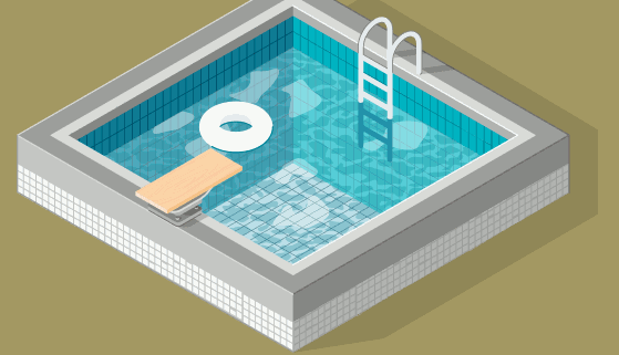
In my weekend (okay: daily) ritual of browsing through Twitter I stumbled upon a tweet from Sarah Drasner of a cool pool HTML5 animation she made.
See the Pen Pool Ripple by Sarah Drasner (@sdras) on CodePen.
Seeing this and a few others floating around made me realize that if I was ever asked to replicate such an illusion that I wouldn’t even know where to start. Well the good thing about CodePen is that the same interface used to see the result also provides the full source code! Time to dissect how this all works.
The first thing that I notice is that the entire HTML for the animation is just a single SVG element. I don’t know a ton about SVG besides that it’s a language for producing scalable vector drawings. I do know of a free tool for viewing modifying SVGs called Inkscape. Let’s check out what this SVG image looks like.
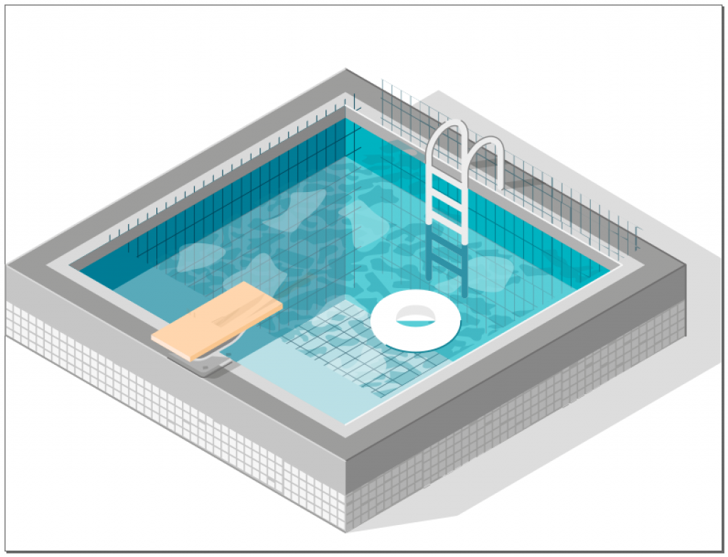
Okay, the SVG is the entire pool. Not-moving, of course. It also appears that Inkscape has a little trouble viewing this SVG- I have a feeling that gridlines for the sides of the pool aren’t supposed to be going through the deck.
Alright, now let’s see what CSS is being used.
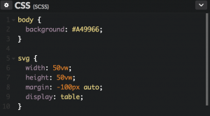
Only ten lines! So this is pretty easy to dissect. I’ll skip over the body background and go straight to line five:
- width: 50vw;
- ‘vw’ stands for viewport width. 1vw is 1% of the viewport of the device. By setting it to 50 here, the SVG take up exactly half of the available space on screen.
- height: 50vw;
- Same as above, the height of the SVG will be exactly half of the device viewport’s width.
- It appears this one isn’t actually necessary: removing the property doesn’t have an effect in Chrome. The SVG even maintains the correct aspect ratio (the image doesn’t appear stretched) when you set it to a different value than the width.
- margin: -100px auto;
- This is setting the top and bottom margin to -100px and the left and right margin to auto.
- Setting the left and right margin to auto is a popular trick for centering a block-level element.
- The -100px top and bottom margin is just to bring the SVG up a little bit in the preview because the SVG itself is a little taller than the pool image inside of it.
- display: table;
- By default the SVG element is an inline-element. Which means the ‘auto’ set on the margin on line 8 wouldn’t work by default. ‘table’ is being used here, but I think ‘block’ could have been used just the same.
That’s it for the CSS! Now to see what JavaScript is being used.
let ring = document.querySelector('#ring'),
smR = document.querySelectorAll('.sm-reflect path'),
turb = document.querySelectorAll('#filter-ripple-2 feImage')[0],
feD = document.querySelectorAll('#filter-ripple-2 feDisplacementMap')[0];
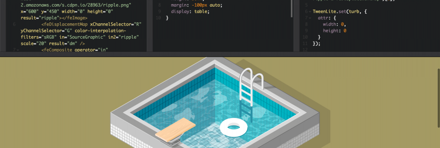
TweenLite.set(turb, {
attr: {
width: 0,
height: 0
}
});
function sceneOne() {
var tl = new TimelineMax();
tl.add('begin');
tl.fromTo(ring, 1, {
x: 0,
y: 0
}, {
x: 30,
y: 10,
ease: Sine.easeOut
});
tl.to(ring, 12, {
x: -170,
y: -80,
ease: Power1.easeOut
});
tl.staggerTo('#reflection path', 4, {
cycle: {
x: [-45, -40, -50, -30],
y: [15, 20, 25, 30],
skewX: ['-10deg', '10deg', '-20deg', '15deg']
},
repeat: -1,
yoyo: true,
ease: Sine.easeInOut
}, 0.001, 'begin');
tl.to(turb, 8, {
attr: {
width: 600,
height: 600,
x: -100,
y: -100
}
}, 'begin+=0.4');
tl.fromTo(feD, 8, {
attr: {
scale: 30
}
}, {
attr: {
scale: 0,
transformOrigin: '50% 50%'
}
}, 'begin+=0.4');
return tl;
}
const master = new TimelineMax();
master.add(sceneOne(), 'scene1');
So we’ve got 63 lines of nicely-formatted JS, which appears to use a single JavaScript library called TweenMax.
What’s TweenMax?
I had never heard of this before so I did a little research and found that TweenMax is a self-contained library that extends another library , TweenLight. This library is used for animating DOM elements. Taken from this page:
…a TweenMax instance handles tweening one or more properties of any object (or array of objects) over time.
And from Wikipedia, “tweening”, short for “inbetweening”, is:
… the process of generating intermediate frames between two images to give the appearance that the first image evolves smoothly into the second image.
Let’s see what this script is doing
TweenLite.set(turb, {
  attr: {
    width: 0,
    height: 0
  }
});
From the docs, TweenMax.set is used to set the properties on an object (in this case, turb ). So here the turb object is having its attr property set, which contains a width and a height. If we look above at line 3 we see that turb is being set to the first (and only) #filter-ripple-2 feImage . This turns out to be an image pointing to https://s3-us-west-2.amazonaws.com/s.cdpn.io/28963/ripple.png. Interesting!
The next line being executed is:
const master = new TimelineMax();
master.add(sceneOne(), 'scene1');
The documentation for new TimelineMax() was more extensive than I expected, but it appears that this is using the library to begin the animation effect.
master.add(sceneOne(), ‘scene1’); is adding a function to begin the animation and giving that animation a label of ‘scene1’.
Now for the guts of the animation, the body of the sceneOne() function.
  var tl = new TimelineMax();

  tl.add('begin');
  tl.fromTo(ring, 1, {
    x: 0,
    y: 0
  }, {
    x: 30,
    y: 10,
    ease: Sine.easeOut
  });
  tl.to(ring, 12, {
    x: -170,
    y: -80,
    ease: Power1.easeOut
  });
First we’re creating a new TimelineMax() and adding the ‘begin’ label. Then, fromTo is called on the ring. fromTo is a function used to tween to the end of the timeline; basically, an animation step. The duration is set to 1 second, is going from 0,0 (the center), to 30,10 (the bottom-right), and the ease is set to easeOut (where you move quickly at first and slow down at the end). From here, the ring is set to move for 12 seconds, towards the upper-left, using an easeOut easing that is slightly more aggressive. Together these animations give a perfect effect of the pool donut bouncing off of the edge of the pool and then being dragged by the water.
Next:
tl.staggerTo('#reflection path', 4, {
    cycle: {
      x: [-45, -40, -50, -30],
      y: [15, 20, 25, 30],
      skewX: ['-10deg', '10deg', '-20deg', '15deg']
    },
    repeat: -1,
    yoyo: true,
    ease: Sine.easeInOut
  }, 0.001, 'begin');
staggerTo is used to “an array of targets to a common set of destination values, but staggers their start times by a specified amount of time, creating an evenly-spaced sequence with a surprisingly small amount of code”. #reflection path is affecting all of the reflections on top of the surface as seen in the gif below.
The first parameter to staggerTo set the duration to 4 seconds. The next parameter cycle provides an array of values to through, for their x and y coordinates and a slight x rotation. ‘repeat’ is being set to repeat indefinitely. ‘yoyo’ first goes through the list of values forwards and then backwards in reverse order. ‘ease’ easeInOut so that it starts slowly and accelerates, and then decelerates. ‘stagger’ is set to 0.001, which is 1 ms, so that the individual reflections are only very slightly off. Lastly, this tween is being added directly to the ‘begin’ label so that it begins immediately, at the same time as the tube animation.
Next:
tl.to(turb, 8, {
    attr: {
      width: 600,
      height: 600,
      x: -100,
      y: -100
    }
  }, 'begin+=0.4');
The turb is added to the animation, which was that interesting ripple image we saw have its attributes set at the beginning. For 8 seconds, the width and height will grow to 600 px, and its position will move to -100 x and -y 100. ‘begin+=.4’ sets the animation to begin 400ms after the ‘begin’ label, which is the start of the animation. This sounds too simple for the awesome effect that its having on the water. Something more is going on here.
<svg xmlns="http://www.w3.org/2000/svg" viewBox="0 0 865.3 659.3">
  <defs>
    <defs>
      <filter id="filter-ripple-2">
        <feImage xlink:href="https://s3-us-west-2.amazonaws.com/s.cdpn.io/28963/ripple.png" x="600" y="450" width="0" height="0" result="ripple"></feImage>
        <feDisplacementMap xChannelSelector="R" yChannelSelector="G" color-interpolation-filters="sRGB" in="SourceGraphic" in2="ripple" scale="20" result="dm" />
        <feComposite operator="in" in2="ripple"></feComposite>
        <feComposite in2="SourceGraphic"></feComposite>
      </filter>
    </defs>
...
As the ripple image is moving through the SVG, the feDisplacementMap and feComposite are causing the pixel data from the ripple image to be the input to displacement map, making the SVG to warp. This is a really clever trick that adds significant realistic quality to the image.
Now for the last bit:
 tl.fromTo(feD, 8, {
    attr: {
      scale: 30
    }
  }, {
    attr: {
      scale: 0,
      transformOrigin: '50% 50%'
    }
  }, 'begin+=0.4');
We haven’t seen feD be used yet. This is targeting the feDisplacementMap element of the SVG, which is displacement map we just saw above. For 8 seconds, the scale will decrease in size and its transform origin moved, starting at the same time as the turb animation. It appears this is just to enhance the quality of the ripples, though it is difficult to detect.
This was pretty fun to dissect and now I have a greater understanding of SVG animations. Thank you Sarah for sharing this pen.