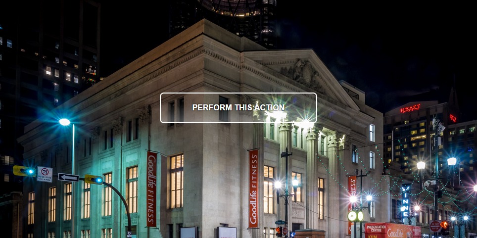
I saw a tweet from Tim Brown and I thought the button with the transparent gradient background was awesome.
Designing & developing @deneenpottery has been awesome. Handmade Pottery in St Paul. Check it! http://t.co/W7QE33eA0w pic.twitter.com/GP31pG5AzC
— Tim Brown (Design) (@timbdesignmpls) December 19, 2014
You have to go to the website he designed to get the full effect because it’s displayed over a video slider. I wanted to see, without cheating by inspecting the code of the page, how I would build that element in CSS.
First, I wanted to get that gradient right. I always use ColorZilla’s css gradient generator, which generates code that works for practically everything. Here’s the gradient I came-up with: http://www.colorzilla.com/gradient-editor/#ffffff+0,ffffff+100&0+0,0+34,0.3+99;Custom. I know, it’s almost impossible to see. Change the color on the far-right to something more contrasty.
I came up with the CSS by looking at Tim’s example and using a bit of trial and error.
button {
    /* Center the button on the background */
    display:block;
    margin: 20% auto;
    /* /Center the button on the background */

    /* Make it nice a readable */
    font-family: Helvetica, sans-serif;
    font-weight: 600;
    font-size: 16px;
    text-transform: uppercase;
    color: white;
    text-shadow: 0 0 .25em black;

    /* Lots of padding, rectangle, rounded corners */
    padding: 1.25em 4em;
    border-radius: .5em;
    border: .17em white solid;

    /* Generated by: http://www.colorzilla.com/gradient-editor/#ffffff+0,ffffff+100&0+0,0+34,0.3+99;Custom */
    /* IE9 SVG, needs conditional override of 'filter' to 'none' */
    background: url(data:image/svg+xml;
    base64, PD94bWwgdmVyc2lvbj0iMS4wIiA/Pgo8c3ZnIHhtbG5zPSJodHRwOi8vd3d3LnczLm9yZy8yMDAwL3N2ZyIgd2lkdGg9IjEwMCUiIGhlaWdodD0iMTAwJSIgdmlld0JveD0iMCAwIDEgMSIgcHJlc2VydmVBc3BlY3RSYXRpbz0ibm9uZSI+CiAgPGxpbmVhckdyYWRpZW50IGlkPSJncmFkLXVjZ2ctZ2VuZXJhdGVkIiBncmFkaWVudFVuaXRzPSJ1c2VyU3BhY2VPblVzZSIgeDE9IjAlIiB5MT0iMCUiIHgyPSIwJSIgeTI9IjEwMCUiPgogICAgPHN0b3Agb2Zmc2V0PSIwJSIgc3RvcC1jb2xvcj0iI2ZmZmZmZiIgc3RvcC1vcGFjaXR5PSIwIi8+CiAgICA8c3RvcCBvZmZzZXQ9IjM0JSIgc3RvcC1jb2xvcj0iI2ZmZmZmZiIgc3RvcC1vcGFjaXR5PSIwIi8+CiAgICA8c3RvcCBvZmZzZXQ9Ijk5JSIgc3RvcC1jb2xvcj0iI2ZmZmZmZiIgc3RvcC1vcGFjaXR5PSIwLjMiLz4KICAgIDxzdG9wIG9mZnNldD0iMTAwJSIgc3RvcC1jb2xvcj0iI2ZmZmZmZiIgc3RvcC1vcGFjaXR5PSIwLjMiLz4KICA8L2xpbmVhckdyYWRpZW50PgogIDxyZWN0IHg9IjAiIHk9IjAiIHdpZHRoPSIxIiBoZWlnaHQ9IjEiIGZpbGw9InVybCgjZ3JhZC11Y2dnLWdlbmVyYXRlZCkiIC8+Cjwvc3ZnPg==);
    background: -moz-linear-gradient(top, rgba(255, 255, 255, 0) 0%, rgba(255, 255, 255, 0) 34%, rgba(255, 255, 255, 0.3) 99%, rgba(255, 255, 255, 0.3) 100%);
    /* FF3.6+ */
    background: -webkit-gradient(linear, left top, left bottom, color-stop(0%, rgba(255, 255, 255, 0)), color-stop(34%, rgba(255, 255, 255, 0)), color-stop(99%, rgba(255, 255, 255, 0.3)), color-stop(100%, rgba(255, 255, 255, 0.3)));
    /* Chrome,Safari4+ */
    background: -webkit-linear-gradient(top, rgba(255, 255, 255, 0) 0%, rgba(255, 255, 255, 0) 34%, rgba(255, 255, 255, 0.3) 99%, rgba(255, 255, 255, 0.3) 100%);
    /* Chrome10+,Safari5.1+ */
    background: -o-linear-gradient(top, rgba(255, 255, 255, 0) 0%, rgba(255, 255, 255, 0) 34%, rgba(255, 255, 255, 0.3) 99%, rgba(255, 255, 255, 0.3) 100%);
    /* Opera 11.10+ */
    background: -ms-linear-gradient(top, rgba(255, 255, 255, 0) 0%, rgba(255, 255, 255, 0) 34%, rgba(255, 255, 255, 0.3) 99%, rgba(255, 255, 255, 0.3) 100%);
    /* IE10+ */
    background: linear-gradient(to bottom, rgba(255, 255, 255, 0) 0%, rgba(255, 255, 255, 0) 34%, rgba(255, 255, 255, 0.3) 99%, rgba(255, 255, 255, 0.3) 100%);
    /* W3C */
    filter: progid:DXImageTransform.Microsoft.gradient(startColorstr='#00ffffff', endColorstr='#4dffffff', GradientType=0);
    /* IE6-8 */
}

button:hover {
    background: rgba(255,255,255,.6);
    cursor:pointer;
}
button:active {
    background: rgba(255,255,255,.8);
}
I think it turned out pretty good. I used ems after defining the font size in pixels, so it hopefully scales well if the font size were to change. I realized the moving background really adds to the effect. I didn’t want to dive that far into it with this demo, so I wrote some quick code to rapidily change the background.
Full demo was written using JSFIDDLE: http://jsfiddle.net/8rbh92ho/1/
Beautiful photographs used in the demo are copyright their respective owners, found on Flickr: